Some trends are so ridiculous they’re just…scary. Fidget spinners, unicorn everything, and the extreme hype over tacos (maybe those can stay) are just a few trends most of us will be glad to phase out in 2019.
Unfortunately, trends aren’t confined to the retail, beauty and restaurant industries. Business websites fall victim to overhyped trends as well. But not all business website trends are worth your small business’s time, energy or investment.
Here are the top business website trends to avoid in 2019.
Oversimplifying
The most iconic brands have it figured out: Simple is better. Apple, Google, Coca-Cola and Nike love using plain white backgrounds, simple imagery, and tons of negative space to cut down the clutter.
They’re calling this shift to simplicity “flat design.” Basically, it reduces everything on their business websites to the bare bones, or the basics required to get consumers the information they need to take action.
Flat design helps websites load fast, because the practice ditches high-resolution, slow-loading images and videos that weigh down your website. And it cuts down on overly complex or wordy copy.
But there really can be too much of a good thing.
Businesses that remove too much content from their websites risk inadvertently losing the stuff that was earning them business in the first place. After all, it can be hard to judge which content really resonated with consumers before deciding what to remove.
Successful small business websites should be simple enough already that you don’t feel the need to jump on the flat design train just yet. Focus instead on writing clear, compelling content and placing it toward the top of your home page. Pair that with visible calls to action (buttons or large text links) that hook in to your social sites and help site visitors get in contact with you. And if your site still loads quickly, you’re good to go.
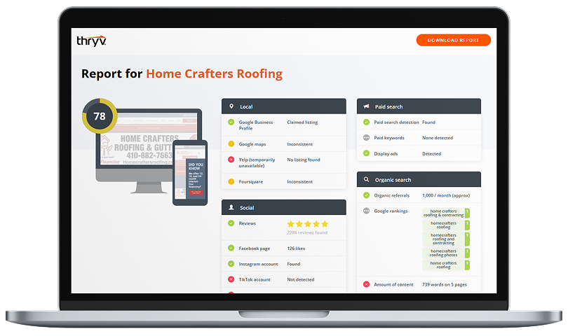
Pro tip: Having trouble connecting your calls to action to your business? Thryv includes a Client Portal with custom calls to action and helps you place these same buttons across your listings, social media pages, and even your business website. Everything’s connected and in sync.
Breaking “The Grid”
Speaking of design…
One of the latest trends in web design is breaking “the grid.” A grid is exactly what you might imagine—a preset structure that helps designers align and organize images and copy on the page.
Grid systems are no longer just for graphic designers and web developers. Because many small business owners know if you don’t want to shell out a ton of cash, sometimes you have to put on your developer/designer hat and build your own website.
For business owners who maintain their own websites, you most likely rely on your website builder or software’s built-in templates and layouts. Most have several options to choose from to customize your website’s look and feel. And lately, these templates include new, radical designs that deviate from the more traditional, grid-focused symmetrical layouts.
Some business owners are choosing to break the oh-so-trusted grid to achieve more creative layouts and eye-catching designs. So they’re shelling out mad cash for these fancy new templates or asking their web developers to design ones specifically for them.
But here’s your warning. Choosing to break the grid is much more suited to well-established and super-modern brands than to the typical small business. When consumers visit websites for brands that have substantial awareness in the marketplace, they’re willing to look around for what they need. But when they arrive at small business websites, they’re much more likely to leave and look elsewhere if the information is too sloppy or disorganized.
Overusing Videos and Animations
Everyone loooves a good dog gif…
…business owners and web developers, included.
So more and more businesses are including videos, animation, motion graphics, and even gifs, on their websites.
Videos actually work well, when we use them appropriately. For example, video backgrounds are proven to increase conversions. But videos can also cause significant problems for websites that don’t use them wisely or aren’t suited to host them.
First, they can cause really slow load times.
And when pages take too long to load, consumers leave and go elsewhere. Not only that, search engines like Google punish your pages for slow load times, pushing them further down the pages of search results. So your search engine optimization (SEO) could take a big hit as well.
Next, while videos work for many brands, they can actually cause consumer fatigue as well.
When consumers are forced to scroll through endless videos and animations, however valuable they may seem, they lose focus. So they’re less likely to consume the information that could get them to take action. Basically, people get too tired to pay attention to the pieces of your website that actually make you money, like Book Now or Contact Us buttons and links.
I’m not saying to avoid videos or motion graphics altogether. But less is more. One great video about your business and a couple high-quality testimonials should do the trick.
Adopting Any Radical Business Website Trends at All
If you sensed a trend in this post (no pun intended), that’s because there is one.
Here’s the deal. Not even the most popular business website trends are impressive enough on their own to warrant an immediate change to your site. Instead, if you think your website needs some work, test small, incremental changes one at a time. Trade a photo for a video, and see how consumers react. Then keep going, and track the results of your changes as you go.