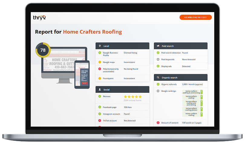
The idea of responsive web design is a relatively new one. Back in the olden days, webpages were laid out for viewing on desktop machines, and were often accompanied by disclaimers like “This page best viewed with Internet Explorer 5.0 or later, at a resolution of 1024 x 768.” In other words, the website didn’t adjust to the user… it was up to the user to adjust for the website.
However, users have been making the shift from desktop to mobile over the past couple of years. Mobile use has grown exponentially, and the sheer number of available devices has made it painfully difficult to design custom websites for each.
Enter responsive design. The idea is to design a single website that will display properly on desktop PCs, smartphones, tablets, and every option in-between. As this infographic shows, 2013 marks the year that responsive design has made the move from luxury to necessity. After all, competition for mobile traffic is fierce, and if you’re not offering your customers an optimal web experience, they’ll be all too happy to click over to your competitors.
Some of the key takeaways from this infographic:
- Although mobile use is on the rise, most people still use a variety of devices to perform their transactions, whether browsing the internet, shopping online, managing their finances, or planning a trip.
- In addition to providing users with an optimal web experience, responsive design is also cost effective and easy to manage.
- Websites that are designed responsively have an SEO advantage over sites with multiple versions or sites being served up on inappropriate platforms.
- Responsive design places greater emphasis on website content, making it an ideal approach for publishers and other content marketers.


