Colors
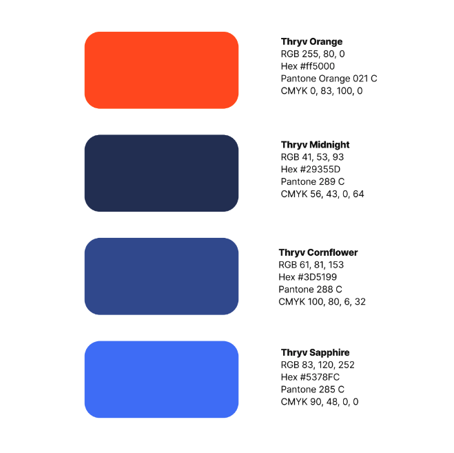
Primary Palette
The primary palette is the foundation of the Thryv brand and plays a critical role in recognition and clarity.
Purpose: Brand recognition, emphasis, and action.
Use when: You need to lead the eye, highlight key moments, or signal primary actions.
Thryv Orange: Use for headlines, buttons, icons, key highlights, and calls-to-action. Apply with restraint—orange is most effective when used sparingly and intentionally.
Midnight: Use for primary backgrounds, large UI surfaces, navigation, and high-contrast layouts. Midnight provides balance and supports readability across digital experiences.
Primary palette should always be prioritized over all other color groups

Secondary Palette
The secondary palette provides flexibility and expressive range while remaining complementary to the primary palette. These colors support broader storytelling and layout needs without overpowering the brand’s core identity.
Purpose: Flexibility and visual support.
Use when: Additional color variation is needed to support layouts, illustrations, or campaigns without overpowering the brand.
Secondary colors should complement—not compete with—the primary palette.
Do not use secondary colors as primary calls to-action or dominant brand identifiers

Neutrals Palette
The neutrals palette supports readability, balance, and accessibility across all platforms and applications.
Purpose: Readability, structure, and accessibility.
Use when: Designing content-heavy layouts or long-form experiences.
Always prioritize neutrals for body copy and extended text blocks.
Neutrals form the foundation of the layout and allow brand colors to remain impactful.
Note: Neutrals do not count towards the 3 colors maximum rule.